I recently discovered this nonprofit organization and loved their message. We can change the world when we help one girl at a time.
"Given the opportunity girls living in poverty are uniquely capable of changing their lives and the lives of their brothers, sisters, communities and countries for the better. It's a ripple effect that's a revolution in the fight against poverty."
Please go to www.girleffect.org to learn more!
Wednesday, November 3, 2010
Tuesday, October 26, 2010
Wedding Invitations
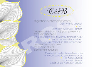
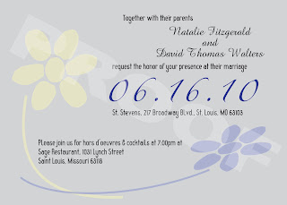
Below are a couple of Wedding Invitation options I created for a friend. The third option that was selected for her wedding will not be posted until after the wedding is over. The colors they would like to use would be some hue of yellow, blue, and gray. The look was intended to be simple yet elegant with both classic and modern elements. One choice I provided focused on an interesting, bold graphic. The other focused on interesting and eye catching typography with a more subtle graphic.
Version #1, Bold Palms
Here, the eye is drawn to the images of the palms and the bold colors which lead you to the important information.
Version #1, Playing with Type
Whereas in this option, the text is what draws your attention first. The graphics function as more of a subtle, but interesting background image.
Version #1, Bold Palms
Here, the eye is drawn to the images of the palms and the bold colors which lead you to the important information.

Version #1, Playing with Type
Whereas in this option, the text is what draws your attention first. The graphics function as more of a subtle, but interesting background image.

Wednesday, June 30, 2010
Platinum Sports
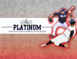
I created this as a Page 1 for a Powerpoint presentation. They are running a contest amongst some of their staff and whichever wins will be printed and used as the first page of a brochure. The concept was to utilize real photos of players involved with Platinum Sports while keeping the look professional and interesting. I added the red drop shadow around the players to emphasize their mid-action positions. I also added a filter to them to give it a softer feel which complements the background texture.
UPDATE: The Platinum Sports graphic was the contest winner, therefore will be printed and used as a brochure for the company!
Monday, May 24, 2010
Before and After. And then, Happily Ever After!
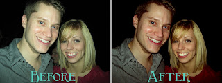
This handsome couple fell victim to the ever-dangerous "bright flash, close up, in a dark place" syndrome. I really liked this photo of them so I adjusted the levels in Photoshop to bring the color back to their faces. When doing this, it's a good idea to use the Selection Tool or Magic Wand tool to select and copy their teeth onto a separate layer. That way when you play with the levels and darken everything else, you won't darken their teeth. Turns out, people don't like when you do that! I also removed the little smily lady in between their heads. She's precious but was kind of a distraction. When the background is dark like this, removing small objects in the background is a snap! I think the after photo is great and much more accurate to their natural beauty! Fast forward to current day, they are engaged! Congratulations you two!
Flowers, because flowers are pretty
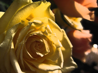
These flowers were modified in Photoshop for a class I took last summer. This is just a fun example of what you can do to a pretty, but semi-boring, photo of some flowers. Play with filters and adjustments in Photoshop to get some really fun and dynamic results without looking overdone or too "Photoshoped."
Business Card for a Grilling Company
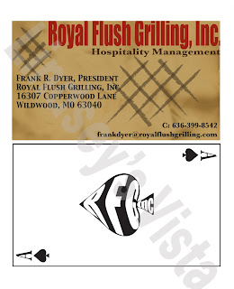
This business card was created for Royal Flush Grilling. The top is the front, the bottom is the back. His company name inspired the playing card theme on the back. I added the grill marks and the burnt paper background to give the illusion it had been grilled. The bright red color was kept to just the company name to draw the eye there first. On the back, the company initials are squeezed inside the spade in the middle.
Annual Crawfish Boil
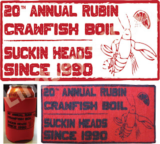
I created this graphic for a client who attends a Crawfish Boil annually. I found a lot of great options for free fonts online, this being one of them. I wanted the graphic to have a rustic look which is why I found this font especially fitting. The client submitted the graphic in Vector eps. to MadeToOrder to have them put it on a small red towel and a red can koozy (both pictured above).
Wednesday, May 19, 2010
Baby Shower Invitation
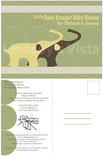
I created this Baby Shower Invite for a client who was throwing the shower for her sister. The pattern and color scheme were consistent with the bed set that the parents picked out for the baby. The graphics (including the elephants) were drawn by hand via Illustrator CS4. It is a postcard style invitation with a graphic on the front which is carried over to the back of the card. The back of the card also has all the important information and is set-up so they can fill out the mailing information.
Recycling Ad
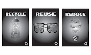
This assignment was a 3 series of Recycling Ad for a newspaper. The idea was to create three ads with the same overall theme to be used in three different issues of the paper. Keeping the theme consistent but giving the viewer something new and different each time they see the ad in the paper. The restrictions with this ad were obviously, black and white only, as it is for a newspaper. This was my second piece featured in the College's Art Show.
Wine Labels
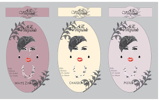
This is a series of three wine labels I created for a Graphic Design class. They were one of two of my pieces featured in the College Art Show. The labels would have a die cut around the label as well as the leaves that extend past the edge of the label. I was restricted to two colors only with this assignment. I chose to use red to emphasize the lips and black for everything else. Then, I printed the labels on different colored (and textured) paper to differentiate the flavors of wine.
Welcome!
Hello and welcome to my blog! My name is Lindsey and I intend to share with you my view... my view on design, some samples of my design work, and all sorts of things I find that I like!
I am a St. Louis local, Freelance Graphic Designer, Meeting Planner, and Graphic Design student. Meeting Planning is my profession but Graphic Design, Photography, and art in general is really my passion. I typically work with print design but am in the process of learning the world of HTML and CSS coding. This blog will most likely go through a lot of changes while I'm learning these things and hopefully, the end result will knock your socks off!
Subscribe to:
Posts (Atom)