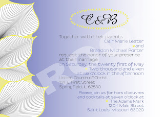
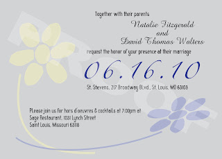
Below are a couple of Wedding Invitation options I created for a friend. The third option that was selected for her wedding will not be posted until after the wedding is over. The colors they would like to use would be some hue of yellow, blue, and gray. The look was intended to be simple yet elegant with both classic and modern elements. One choice I provided focused on an interesting, bold graphic. The other focused on interesting and eye catching typography with a more subtle graphic.
Version #1, Bold Palms
Here, the eye is drawn to the images of the palms and the bold colors which lead you to the important information.

Version #1, Playing with Type
Whereas in this option, the text is what draws your attention first. The graphics function as more of a subtle, but interesting background image.


No comments:
Post a Comment